Blog 7 WAYS TO KILL A WEBSITE

Browsing various websites and navigating the web can often be a daunting and sometimes frustrating task as you sift through the mounds of garbage to find what you’re looking for. There are some excellent websites out there to be sure, but there are also a lot of dreadful ones too.
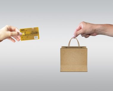
Creating and maintaining high-quality websites is more important today than ever. Higher quality equals more revenue and better searchablilty.
A bad website neglects to consider the site visitor’s experience in some fundamental ways. The following are my pet peeves when a website misses the mark.
The site is not adaptable to my device. A site not developed for a mobile phone is often skipped over for an easier to rea site. Now Google is demanding that your site comply. (or they will drop you)
Long, Text-Heavy and Blocky Paragraphs of Unbroken Text
I really have to be into a topic or desperately need to learn the information to trudge through big chunks of unbroken text. The trend is to use more images to capture your audience’s attention. Additionally, web users are impatient, so make your content easy to read and non-intimidating. Use images, titles, icons, sub-titles, small paragraphs, bullets and numbering.
Unchanging or Out-Dated Content
If I start reading content on a site and soon discover that the content refers to outdated information, I’m gone. My reasoning is that there’s got to be comparable information online that’s more current. If you keep your content fresh your site will attract repeat visitors. And repeat visitors are more likely to turn into customers.
Broken Links. It’s simple. Check your site and fix them. Or I will leave. One way to avoid broken links is to not link to magazine or newspaper articles. If they change their site, your content is lost. Make a copy and stick it on your site.
“Me, me, me!” instead of “You, you, you”
Sorry to tell you, but, no one cares about you, your company or your thoughts. What they do care about is what you can do for them. Sites that show pictures of the company building or tout their deep philosophy on the way business should be conducted really don’t bode well for keeping the interest of your site visitors.
Sites that speak directly to potential customers about how they can solve their problems, make their lives easier, safer, richer or more comfortable, have a much better chance of keeping their audience.
Inconsistent Navigation
Imagine sitting down at a restaurant and the waiter comes over to you and hands you five different menus, one for the appetizers, one for the soups and salads, one for the entrees, one for the desserts, and one for the drinks. Then imagine if each menu had a different format, layout and method for listing the items. I really don’t want to work that hard at picking out my dinner, I’m hungry and I just want a meal. Don’t make your visitors work hard by expecting them to re-learn your navigation system each time they enter another section of your site. They too are hungry; for useful information and they’re even more impatient.
Inconsistent Look & Feel
When the look & feel completely changes from one page to another in a website, I think I am visiting another site, another company, a partner or subsidiary. This screams poor planning and often results from tacking on new sections later after the original site was built. It may be tempting to stray from the original design if adding pages; you may currently have a better design. But wait till you do a complete next-generation re-design of the entire site before introducing a new look & feel. If not, lots of visitors will be scratching their heads with one hand and possibly clicking away with the other.
Have no Call to Action. Ive just read some great information on your site, but there is no prompting me to learn more, get more, keep in touch, etc. Give me a reason to contact you on every page.